Robert Slimbach is a type designer Adobe systems. Many of his typefaces are based on classical influences. Caflisch Script Pro was created in 1993 and is based on the handwriting of Max Caflisch. It comes in 3 styles light, normal, and bold. It is an Opentype font. (Source: Wikipedia). This font is only available on PC versions of Adobe products.
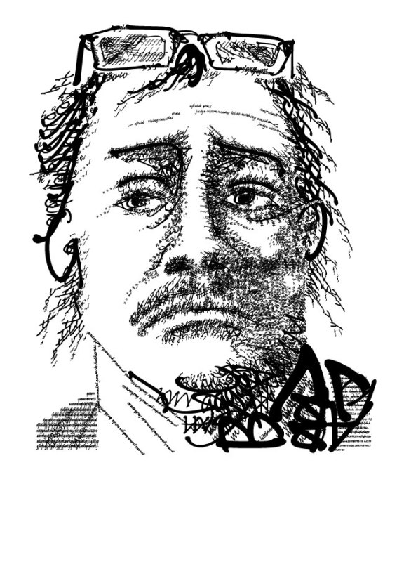
I chose this font because the ability to use 3 different styles. I also chose this font because I like the organic nature of the lines of the letters. I think it works best with human face. It would help me better express all the character in my self-portrait. I just wanted to let you know, back in my day, we didn’t call them selfie. I believe I was pretty successful. I was never good at self-portrait and always had an issue with eyes. I was shooting for more tonal changes. I believe I did an okay job, but I’ve done better. I only used tools in the character tab, which required a lot of extra work. There is about a 50% written word and 50% fonts. I didn’t want the written word to be obvious to the viewer. If the viewer wants to spend more time looking at the image they will find words that have context to the image. The font is Calfisch Script Pro.

What font is it?
LikeLike
The font is Calfisch Script Pro
LikeLiked by 1 person
some information missing from description I updated
LikeLiked by 1 person
Looks great by the way! Very realistic 🙂
LikeLike
This is very good! The font you used makes it look very realistic
LikeLike